
Trying to figure out Toonboom inking. This is just a throwaway doodle I inked pretty quickly. Is it just me or is it hard to see exactly what you're doing? I guess I'm just not accustomed to the interface yet.

 oh, heck, why not in color?
 I decided to extend upon this panel, because it'd be easiest to work with this scenery (and the pose is so broad that I was hoping it'd get me thinking broadly.


 Complete with less-broken wrist.


 Gonna study another one of these sometime. It's kind of hard capturing the nuances of a toy with lines, but fun. I'm working mostly from black-and-white prints, so I noticed that on the bow tie I went by the curve, not where the red ends.
 The dog's face is framed by the door to the coop. Within that, the carefully-placed highlight also hugs the face. Fagan's framed by the coop's wall. Nice details like the tree and the sack also embellish but frame the interaction between these two.
 The board that is atop the coop's door that stretches all the way across was messed up in my final lines. I made it way too small on the far side, so it sort of clips awkwardly. I need to be more careful about preserving shapes like that.
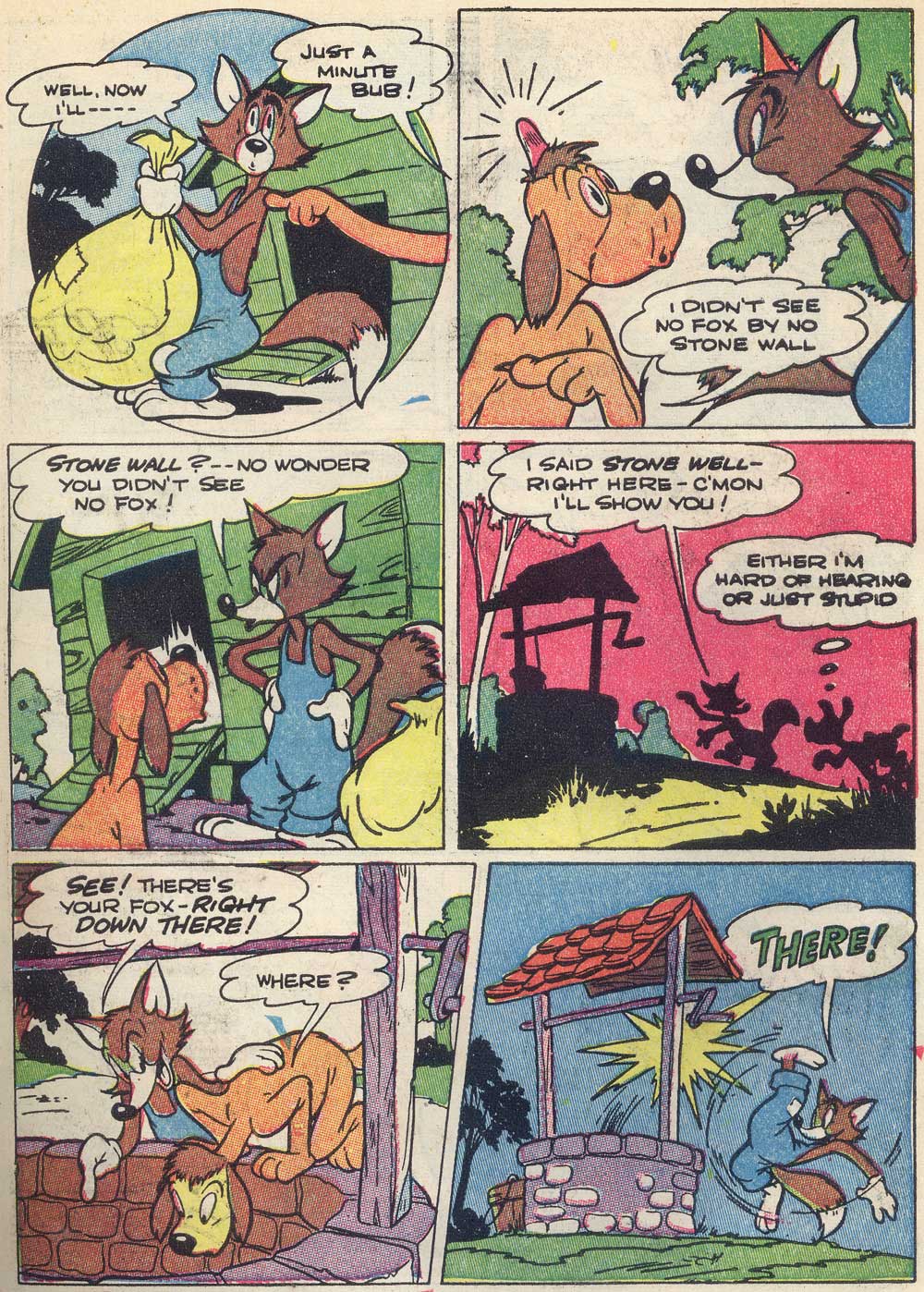 Did I ever post this whole page? Even if I did, here it is again.
 Here's my go at the 4th, silhouette panel. It wasn't a bad copy but the line quality turned out really badly so I'm not posting a version that isn't simply overlayed for comparison. You can see my errors.
 Here's my start on panel 3. Sorry the scans like this are such a mess. I'm using very light col-erases. I love these useful pencils, but they're my only col-erases. I could use some other colors (regular blue, mostly). Here's what the scan looks like normally.
 Squinty squint.


 Now that I've uploaded this, I see a huge problem with this second one: the bottom right foot. I made it a stump! I totally missed that defining line on the inside of the leg. He's supposed to be slightly pidgeon-toed, and instead I made him have a deformed half-foot thing. Yikes!!

 ugh, i feel really awful! (i forgot to mention, painkillers also make me nauseous). lots of mistakes. oh well. good night!


 Old cartoonists can pull off improper English in the best ways. No one else has license to language like these guys.

 I love this page of Eisenberg's. This is actually the last panel of the page (you will see more as I study them) but I loved it so well that I had to draw it first.
 I wound up rounding out some of Foxy. His hand is the most noticeable. His upper body also seems evened out, puffed a bit, even. I dug the details in too far, mostly because I had to erase them a few times when I was struggling with the face. At first I missed the angle of his brow. I rounded out some of the contrasts, and ate up some of the space. Hopefully I can focus more on that in the closer compositions of the page in the future.
 A very nice coloring book page! I have no idea who the artist was, though. If any of you experts out there could tell me, I'd be grateful. Anyway, so I had a print of this image, and decided to take it on. I'm out of practice, but it was fun to balance all of the elements. I decided to use this page to practice for some more Eisenberg drawings I want to do-- Eisenberg's backgrounds are wonderful, and I wanted to feel more confident before taking them on.


 The line of action was a little bit muddled. I attempted to exaggerate it by making his head a little lower, but I think that threw off the proportions a little (note the foot and... musketeer-poncho-thing). It also resulted in a less flowy pose. I want to grasp lines of action better, mine always seem to get lost.


 Again, trying to make Shaniqua's eyes less rounded-out, and trying to adjust her mouth/cheek area to be more loyal to the original.


