Showing posts with label construction. Show all posts

Thursday, June 3, 2010

Polite Porky Lamp


Gonna study another one of these sometime. It's kind of hard capturing the nuances of a toy with lines, but fun. I'm working mostly from black-and-white prints, so I noticed that on the bow tie I went by the curve, not where the red ends.

Like I said, I was pretty unsure on the nose. Maybe on the next angle, I'll try a different, more detailed way of capturing it.

Ahh, I totally didn't make the vest dimensional enough on the right.

Last of this page

The dog's face is framed by the door to the coop. Within that, the carefully-placed highlight also hugs the face. Fagan's framed by the coop's wall. Nice details like the tree and the sack also embellish but frame the interaction between these two.

The characters are making eye contact. The dog's line of action is straighter than Fagan's, and it's related to it, but they aren't parallel. They almost form a "D".

The boards on the left, back side of the coop are totally mismatched from the closer side. It breaks the shape down into something more organic (much like the shingles on the well from a few posts ago). I had to resist the temptation to line them up. I think it's funny this way-- this coop was built by hand. I should bear this in mind when I do my own backgrounds. Man-made stuff can be misaligned and asymmetrical (organic!) just like natural stuff. Especially if it's made of wood, and probably by somebody's grandpa.


The board that is atop the coop's door that stretches all the way across was messed up in my final lines. I made it way too small on the far side, so it sort of clips awkwardly. I need to be more careful about preserving shapes like that.

I accidentally made Fagan squeeze himself too much-- to the point where I skinnied up his abdomen! ;)

I think the hardest part about studying Eisenberg is his treatment of eyes. They're so tiny that they're very easy to mess up-- even a few specks of poorly-considered graphite change the directionality.

Friday, May 28, 2010

More cute Porkys


Now that I've uploaded this, I see a huge problem with this second one: the bottom right foot. I made it a stump! I totally missed that defining line on the inside of the leg. He's supposed to be slightly pidgeon-toed, and instead I made him have a deformed half-foot thing. Yikes!!

Man, the meds they put me on for my tooth really packed a whallop. I tried to go into work yesterday and wound up getting so sick I upchucked. Which kind of sucks, because I really need the hours.

Speaking of capitalism, if you're awesome, there's a shiny orange button to your right, now!

Speaking of shiny orange buttons, my birthday is in a mere 3 days (May 31). ;)

Wednesday, May 26, 2010

i didn't see no fox


today I got that tooth pulled. I am either really feelin' a gigantic bloody crater in my mouth or drowsy off of painkillers. I did this study during a sort of in-between moment this evening:

I might do a drawing or two before bed since my sleep is all messed up from today, but I also just might crash. It's hard to tell.

Tuesday, May 25, 2010

Just a minute bub!

Old cartoonists can pull off improper English in the best ways. No one else has license to language like these guys.

I did this in someone else's basement tonight, and I feel like I'm committing a faux pas if I stay on here for too long. I took a few little liberties in this one though, especially on Fagan's hands. Not sure if it worked out or not. The dog's arm/hand aren't perfect, looks sort of squished and wimpy. I also evened out some of that lovely asymmetry on the cheeks. No bueno. I feel like the face is clearer than in yesterday's panel, though.

Tomorrow I get a tooth pulled!

Monday, May 24, 2010

THERE!

I love this page of Eisenberg's. This is actually the last panel of the page (you will see more as I study them) but I loved it so well that I had to draw it first.

Thoughts:

The detail is handled masterfully and reigned in by sensible hierarchy. The shingles and wood grain on the well are controlled by keeping them wrapping the form, but are full of life because they're asymmetrical, organic. They are not in equal rows; notice the extra shingle on the bottom left! I wonder if he drew the shingle to the right of it too small and needed to fill a space. Either way, it's great and works just fine. The wood is also organic, and has some lovely little details, but it's never distracting.

Things made of brick and stone are usually intimidating, but Eisenberg handles it like a pro-- not every stone needs to be drawn. They're the smooth, well-worn, old, and organic types of rocks people used to build things instead of ugly fake bricks. It looks worn and fun to touch. They hug the outside, and of course wrap around the form.

The bucket is a nice touch, and works as part of the well's overall form. It really contrasts nicely with the delicate tree that frames the left side and adds interest. The tree's in silhouette, too, so white it's very delicate, it's nowhere even resembling distracting.

Fagan himself is a beautiful pose! I was attracted to it immediately. I love how he sits in the middle of that perfect circle of a motion line. It's a pose you're not terribly prone to seeing in newer cartoons. It's so round and exaggerated. No one ever kicks back that far. You can tell exactly what has just occurred.

Even Eisenberg's speech bubbles are great. I love how they're cloudy, just for the sake of fluorish. It's also nice since it's in the sky, it almost doubles as a cloud at first blush. The composition has a lot of yummy places for your eye to travel to.
I wound up rounding out some of Foxy. His hand is the most noticeable. His upper body also seems evened out, puffed a bit, even. I dug the details in too far, mostly because I had to erase them a few times when I was struggling with the face. At first I missed the angle of his brow. I rounded out some of the contrasts, and ate up some of the space. Hopefully I can focus more on that in the closer compositions of the page in the future.

I just noticed, too, that the right side of the well tapers off in the wrong way. It should have more mass leaning to the upper right.

ALSO: I discovered a 5B pencil. I'm used to working with harder ones. Anyway, it's fun and you don't need to press as hard (something I need to force myself out of doing). I'm gonna look into getting even softer pencils, soon, if I can scrape together the cash.

Friday, May 21, 2010

The Star Fell with a Crash

A very nice coloring book page! I have no idea who the artist was, though. If any of you experts out there could tell me, I'd be grateful. Anyway, so I had a print of this image, and decided to take it on. I'm out of practice, but it was fun to balance all of the elements. I decided to use this page to practice for some more Eisenberg drawings I want to do-- Eisenberg's backgrounds are wonderful, and I wanted to feel more confident before taking them on.

I like studying these coloring pages and comic covers because they're so clear, big, and appealing. I imagine that the originals were larger than their actual prints, as I do for a lot of comic drawings, which makes detailed areas tend to get murked up in my copies-- places like faces, in particular. Bugs' face here is a little distorted, but I had to eventually just settle for some decreased contrast and shifted angle (namely the cheek on the right side) because eventually it just gets too muddy to keep erasing/redrawing.


When I really get into these, I get very obsessive... and by the end I'm too tired to talk about them much, without a bit of distance!

I forgot to draw Porky's shadow, woops! It was a nice detail, because it grounded him (which is relevant for the image's narrative).

It's interesting to see where the artist breaks/distorts perspective. Note also that the vertical fenceposts are askew, adding some good ol' wabi-sabi to the image, preventing it from being deadened by perspective.

Perspective is interesting. It's beautiful, adds solidity and structure, but taking thoughtful license to it can really make an image feel more organic, cartoony, fun. If that gate to the left had all been in perfect perspective, it would look much more... well, wooden.

I de-fluffed Bugs' tail. I also drew myself into a bit of a corner with Porky's hand that is touching the star, possibly because, in retrospect, I too greatly exaggerated portion of the star that frames it. The artist did exaggerate perspective a bit on the bottom of the star, but I let it get a little out of control.

Wednesday, May 19, 2010

Tom running


I was attracted to this image because of its line of action. I printed it to copy at some point, and just studied it tonight.

The line of action was a little bit muddled. I attempted to exaggerate it by making his head a little lower, but I think that threw off the proportions a little (note the foot and... musketeer-poncho-thing). It also resulted in a less flowy pose. I want to grasp lines of action better, mine always seem to get lost.

I reduced his chin, and his eye makes no sense, really. I also ballooned out the top of his musketeer-poncho-thing.

I want to do more drawings tonight, and then after my optometrist's appointment tomorrow. I need to learn how to structure my days off, now, so that they are full of disciplined study.

Preston Blair sailor bulldog man


I feel as if the pelvis is too high-up, and I softened the angles on the feet so that they aren't as firmly planted. I reduced the contrast by enlarging his bottom quadrant, I think.

Goal: Do a bunch of studies. ASAP.

Monday, April 19, 2010


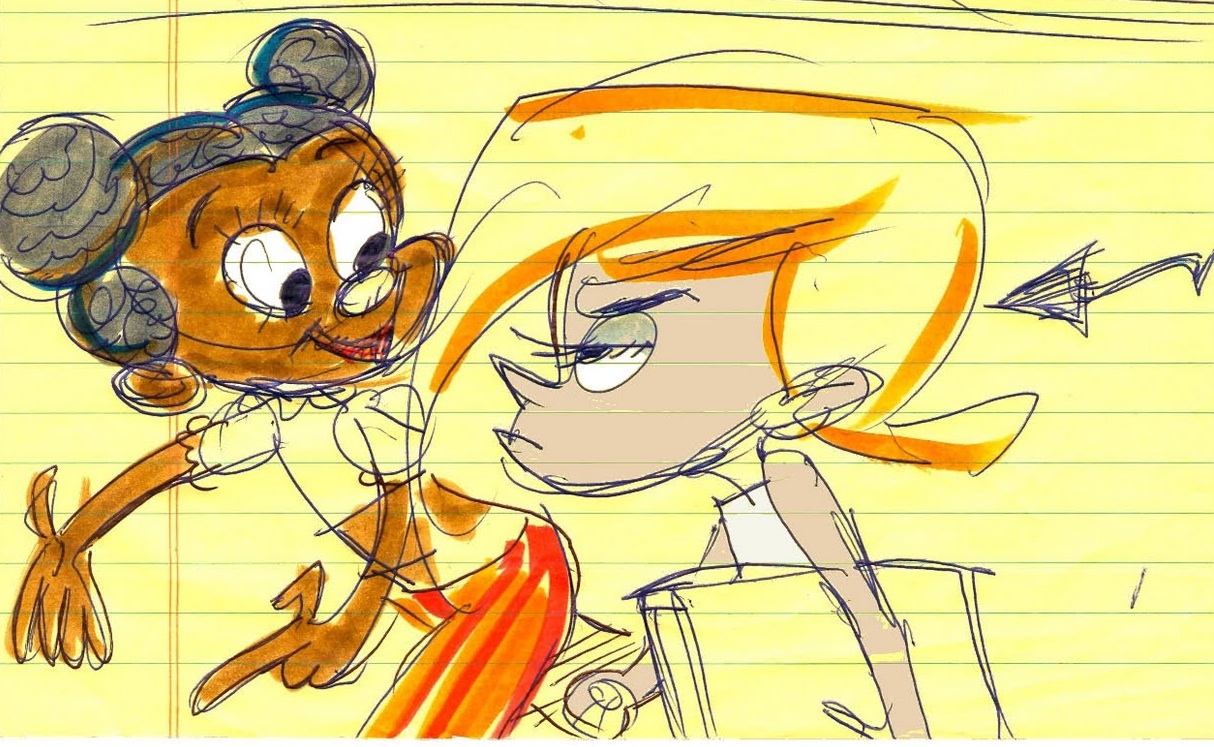
I tried to think about that Shan needs to be behind Roxie. I wanted a little bit of perspective. I wanted to make sure it was clear that Shan was looking at Roxie (though I think Roxie, in my drawing, is not convincingly enough looking straight, right past poor Shan). I wanted to put a bit more space between the hair and the cheek. I feel like I watered down the lines of action.

Friday, April 16, 2010

Roxie angry 2


Why didn't I have this posted forever ago? Ugh... Anyway, I don't like the closest foot too much. I didn't get the right shape on the rim of the moccasin. I also think that in general it could be more contrasty.

Oh, I'm doing some paid work right now, by the way. Hooray!

Thursday, March 4, 2010

Roxie angry 1

John K rough
My start

I moved the arm to the right out a bit, so that the negative space between her body and her arm was more clear. However, I pulled the top of the body shape too much to the right/made it too thick. Will fix tomorrow.

The legs don't feel right; they aren't solid enough. since this scan I've rounded off her knees more, but the perspective on the feet and the leg to the right seem weird.

More soon!

Thursday, February 4, 2010

Curly Fleece Poodle

(I am drawing from the second image, both of these drawings are John's)


My roughest, first attempt at this drawing got deleted, but I still have the overlay (I try to only overlay now during very early stages so as to ensure that I'm seeing the basic proportions correctly).

Couple corrections...

More to come, I'd like to make more corrections before I clean it up. I really like drawing this character a lot. Funny animals are my favorite.

I feel like I misread the cranium, now that I look at it. I should have corrected it when I fixed the eye the first time around... His head is tilted to the left.

Because I want to get in the habit:

- Curly Fleece Poodle has one eye REALLY WIDE and one eye quite narrowed
- He is looking directly at what he's writing... he's really concentrating, because he is a stuffed animal
- His ass is so up in the air that it is coming forward, toward his head
- His big feet are supporting his butt weight

Thursday, January 28, 2010

New toy studies: Tub back

I believe this toy belongs to the indestructible Kali Fontecchio! I am drawing a few of her toys that she's posted, and this is the first of three I started yesterday. I finished this one today.
My first shot turned out pretty slumpy and yucky, so I won't even post it.

So I straightened him out a bit. That head shape is a lot harder than it looks.
The hardest part, however, is that darned hat. It was kind of hard to see in my print-out, and it STILL isn't right. However, my paper was getting worn down from erasing and re-drawing. It is a learning experience.
So, I love listening to podcasts (preferably drawing/cartoon-related or boring informative ones) while I do my studies. Any recommendations?

Wednesday, January 27, 2010

Nicer lines


I would have posted this last night when I finished it, but my internet is down... so, good morning internet!

Most of my problems with this drawing are in the feet area. The sole on the left looks too gummy, and the right ankle seems too flimsy, to me.

Tuesday, January 26, 2010

I told you I'd post more


I want to adjust some things. I want to make the arms flow a bit more, push out his fanny, figure out how to make his hands better-looking, and of course add details...

Time to clean up while making a couple more corrections.

Monday, January 25, 2010

Returning from the Dead


FOOT STILL LOOKS STUMPY
FORGOT TO FIX CHEEK

Okay, I've wasted a lot of time, lately. Well, I guess it hasn't been wasted totally; I've lost like 8 lbs and did some other stuff that was good for me. But time now to stop dinkin' around on things that aren't cartoons.

MORE SOOOOOOOON

Tuesday, September 29, 2009

3 day's break and I get rusty!


Problems...

  • The center line on the cranium off (too far to the left)
  • Mallet too wide on near end
  • Trunk of body too small, not solid enough
  • The hat and carrot are off, but I did not notice this at the time (woops)

tried to fix them for the next step.


Man, I can't let myself go so long without rigorous practice. Stiff and yucky. I'm off to do another that will be better.

Tuesday, September 22, 2009

Anthony's dad again again


Edit, big problem: I made the inside of his mouth all wrong. It should be pushed far back. It makes no sense as it is and I'm a little embarrassed that slipped by.

More problems, but this one turned out clearer and more successfully than the last. I wanted to make sure the facial structure made sense.

Stimpy's eyes look off. Some of the details pinch too hard, are too big. I shrunk Anthony's dad's cranium.

I think I'm gonna go back to trees for a while, but I think these exercises were helpful. I wish I could improve faster!