Friday, April 30, 2010


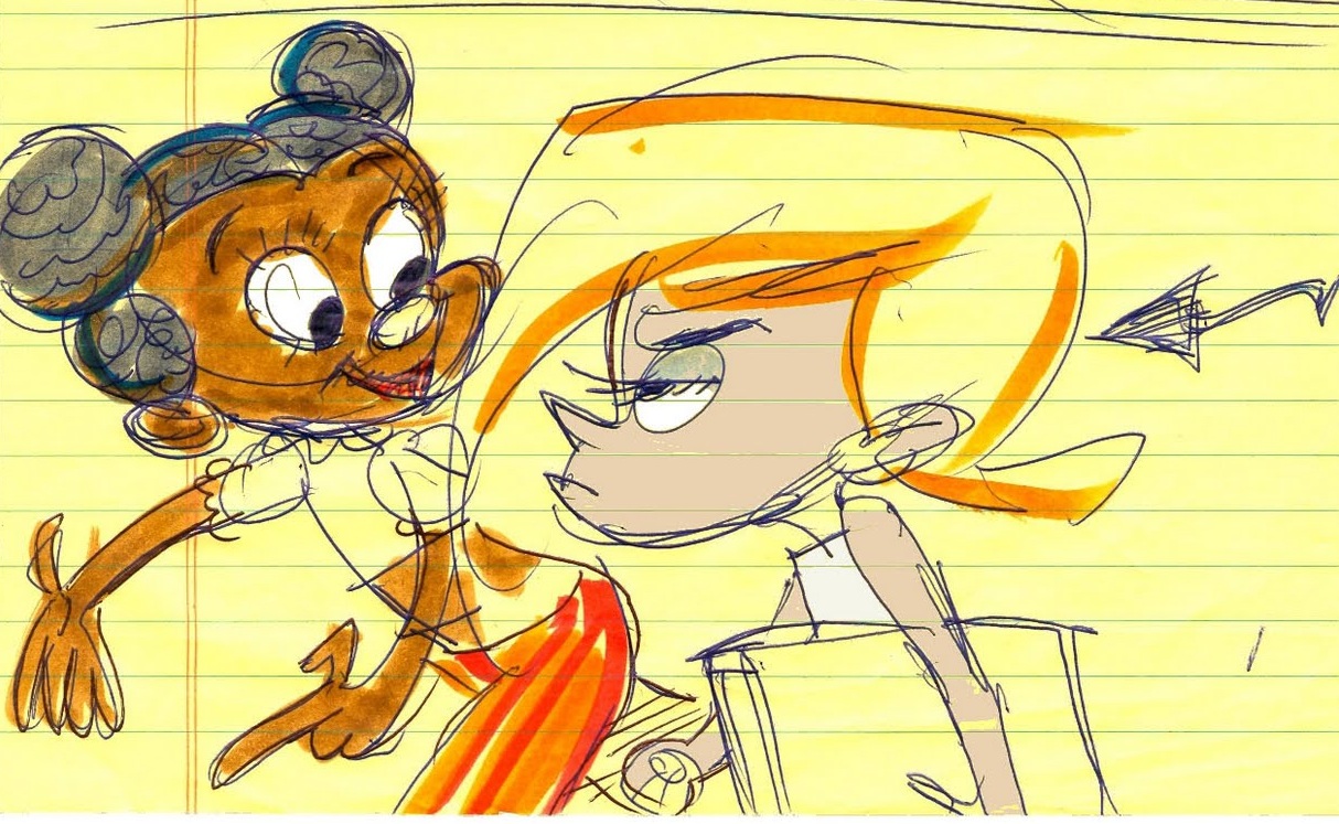
I wanted to get more specific about Shan's eyes. I also more clearly made the jaw and cranium two separate forms:


Again, trying to make Shaniqua's eyes less rounded-out, and trying to adjust her mouth/cheek area to be more loyal to the original.


I think I could have made the hands more solid, and I think there was some loss incurred in Shaniqua's facial region. It looks to me like her cranium got a little mushy. I think I should have placed Shaniqua just a bit more to the left so that Roxie's hair didn't come quite so close to her sleeve.

Also, helloooo allergy season in Northwest Ohio! It has been hard to look at my computer screen as a result.

Monday, April 19, 2010


I tried to think about that Shan needs to be behind Roxie. I wanted a little bit of perspective. I wanted to make sure it was clear that Shan was looking at Roxie (though I think Roxie, in my drawing, is not convincingly enough looking straight, right past poor Shan). I wanted to put a bit more space between the hair and the cheek. I feel like I watered down the lines of action.

Friday, April 16, 2010

Roxie angry 2


Why didn't I have this posted forever ago? Ugh... Anyway, I don't like the closest foot too much. I didn't get the right shape on the rim of the moccasin. I also think that in general it could be more contrasty.

Oh, I'm doing some paid work right now, by the way. Hooray!

Thursday, March 4, 2010

Roxie angry 1

John K rough
My start

I moved the arm to the right out a bit, so that the negative space between her body and her arm was more clear. However, I pulled the top of the body shape too much to the right/made it too thick. Will fix tomorrow.

The legs don't feel right; they aren't solid enough. since this scan I've rounded off her knees more, but the perspective on the feet and the leg to the right seem weird.

More soon!

Tuesday, March 2, 2010

Poodle again

John's original drawing

My study. I feel a little weird about the left foot in particular.

Thursday, February 18, 2010

Color schemes, headaches, etc

Here are some (really zoomed in, compared to their print size) backgrounds for a comic I'm doing for school... mostly interested in practicing with color, and digital painting.


I don't like digital painting anymore (it's so much easier to make stuff look good with paint, I think), but it's very cost-effective and there's no loss of luster through a scanning process. Took a lot of cues from Anne in terms of digital application of spongey looks. She's pretty clearly more advanced than I am, but I can't catch up if I don't start! Anyway, it is fun and educational.

Wednesday, February 10, 2010

More Curly Fuzz Poodle


Another Curly Fuzz Poodle drawing by John.

Round 1: Eek!
I spent quite a while trying for this-- I started a couple of days ago, tried a few times to pick it up again, but I couldn't get it to look right. I didn't bother doing details or cleaning it up because something just seemed wrong about it. I squished it together. Upon closer inspection, I just ATE UP the spaces horizontally. I decided since so much of it was wrong, as a result, to just start on a new piece of paper.
So I started a meticulous do-over, this time checking more frequently how I was doing...
Lots of checking and squishing and fixing.
Finally, it started to look closer to correct.
I don't like the way his ears look. The details are not handled elegantly and the thicknesses of the ears vary. They're also a bit rounded out.

Later edit--
JOHN'S COMMENT:

put perspective in the feet

the one that's closest to us should be bigger than the one that's farther away

be careful of the silhouette while fixing my mistake
So I tried to tweak some things-- I drew the closer foot again on a new piece of paper and Photoshopped it on in (pretty much the same idea as taking an X-acto and taping it in, only less involved with dangerous blades), and also made it so you could kinda see the old foot. Also tweaked the ears while I was at it.