Thursday, June 10, 2010

Two new Fagan poses

I decided to extend upon this panel, because it'd be easiest to work with this scenery (and the pose is so broad that I was hoping it'd get me thinking broadly.

So, Fagan kicks the dog down the well. What does he do next? Like any cartoon jerk, he listens for that whistle and plop:


I feel like I am getting a better knack for line of action. It takes... planning. It's kind of counterintuitive to me for effortless poses to have a lot of messy attempts before you get it right. Maybe that'll go away with time. Or maybe I've just been overestimating the human capacity of good cartoonists, I don't know.
That left foot doesn't look right... I think I may have made his legs too short, because the detail of the pant cuff messes up the silhouette that I had come to like.
The details on the pants were bad ideas, they lose the form underneath. However, I did come to like the hand on the right.

Anyway, so, next, Fagan runs away, breaking the fourth wall, like good cartoons do.


I don't think the closest hand jibes with the line of action. It seems almost broken-wristed. I was trying to emulate the way Eisenberg does Fagan's (and I think I recognize it from some Tom's) hands held up in a cute, paw-like way. I think if I were to redo it I'd rotate the hand about -45ยบ. In fact, I just might.

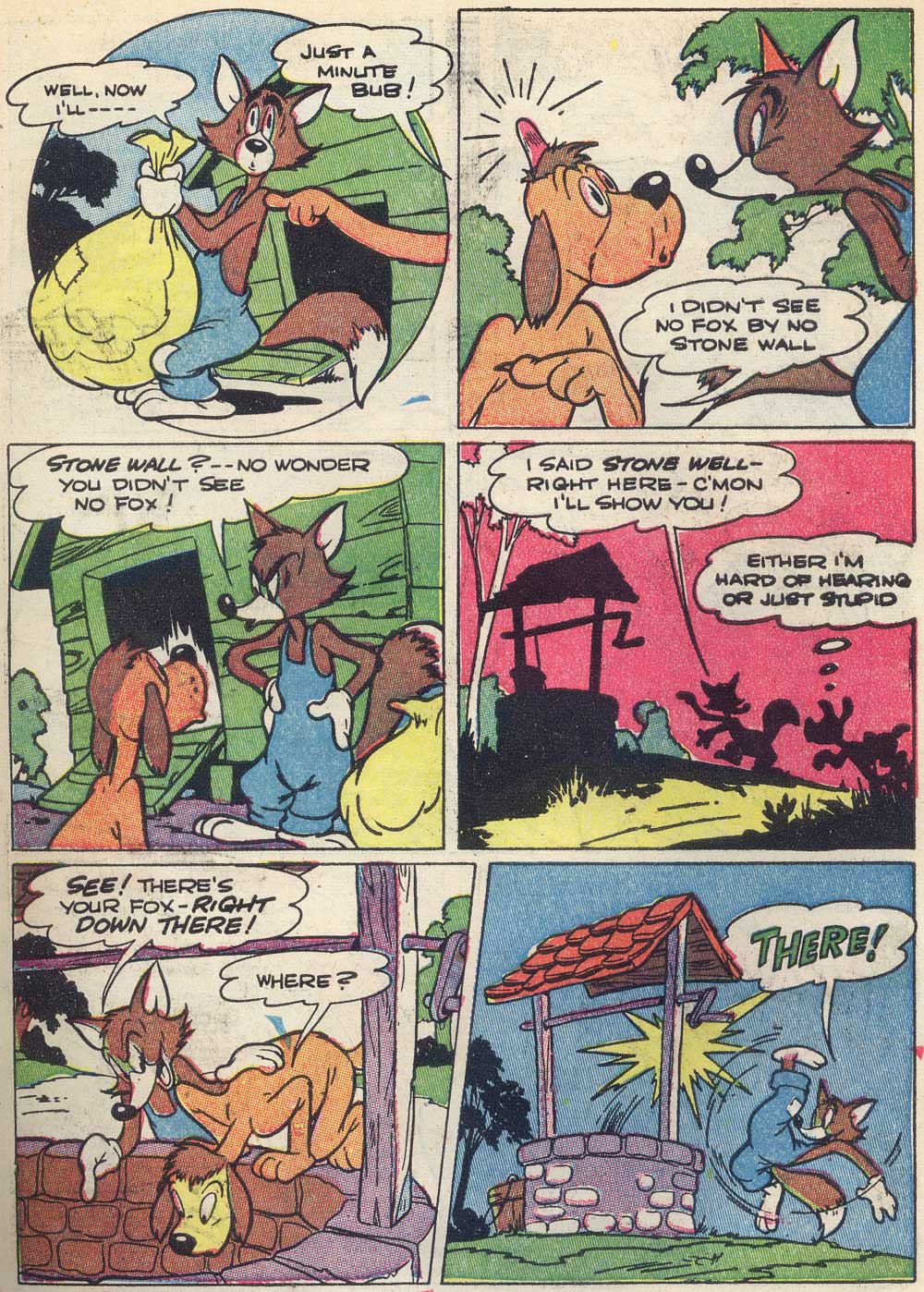
Anyway, for context...

Here's panel 1, the copy and jumping point:


Here are my two poses edited in:


Hmm... I drew them out of scale, and the shrinkage does it no justice! Woops... maybe I should have done the lines thicker to match.

EDIT: I played around in Photoshop to reduce some of the problems.


It's better, the forms make more sense now, but it's a bit pinchy on that leg to the left still. Anyone got any tips?Complete with less-broken wrist.

Thursday, June 3, 2010

Polite Porky Lamp


Gonna study another one of these sometime. It's kind of hard capturing the nuances of a toy with lines, but fun. I'm working mostly from black-and-white prints, so I noticed that on the bow tie I went by the curve, not where the red ends.

Like I said, I was pretty unsure on the nose. Maybe on the next angle, I'll try a different, more detailed way of capturing it.

Ahh, I totally didn't make the vest dimensional enough on the right.

Last of this page

The dog's face is framed by the door to the coop. Within that, the carefully-placed highlight also hugs the face. Fagan's framed by the coop's wall. Nice details like the tree and the sack also embellish but frame the interaction between these two.

The characters are making eye contact. The dog's line of action is straighter than Fagan's, and it's related to it, but they aren't parallel. They almost form a "D".

The boards on the left, back side of the coop are totally mismatched from the closer side. It breaks the shape down into something more organic (much like the shingles on the well from a few posts ago). I had to resist the temptation to line them up. I think it's funny this way-- this coop was built by hand. I should bear this in mind when I do my own backgrounds. Man-made stuff can be misaligned and asymmetrical (organic!) just like natural stuff. Especially if it's made of wood, and probably by somebody's grandpa.


The board that is atop the coop's door that stretches all the way across was messed up in my final lines. I made it way too small on the far side, so it sort of clips awkwardly. I need to be more careful about preserving shapes like that.

I accidentally made Fagan squeeze himself too much-- to the point where I skinnied up his abdomen! ;)

I think the hardest part about studying Eisenberg is his treatment of eyes. They're so tiny that they're very easy to mess up-- even a few specks of poorly-considered graphite change the directionality.

Wednesday, June 2, 2010

Some last Fagans

I was called into my job just a few moments ago, so I'm short on time.

Did I ever post this whole page? Even if I did, here it is again.

Here's my go at the 4th, silhouette panel. It wasn't a bad copy but the line quality turned out really badly so I'm not posting a version that isn't simply overlayed for comparison. You can see my errors.


Here's my start on panel 3. Sorry the scans like this are such a mess. I'm using very light col-erases. I love these useful pencils, but they're my only col-erases. I could use some other colors (regular blue, mostly). Here's what the scan looks like normally.
Squinty squint.

The dog's cranium dividing line is off.