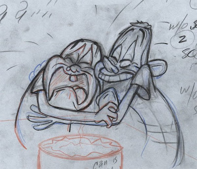
 Drawing above is by Jim (I think) of Spumco.
EDIT: Fixed the sleeve thing.
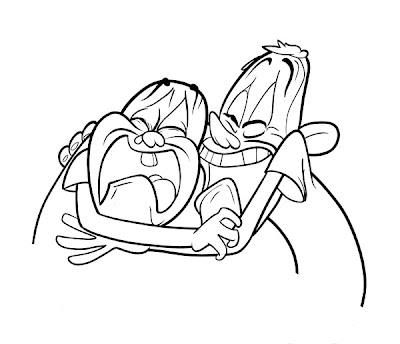
Here's my first inking study. I'm actually surprised with the outcome. I should have pushed line width variation more, now that I see it from so far away. More thick lines holding together the larger forms. The noses and eyes have some uncertainty to them. I don't know if I should have inked Ernie's jaw under his arm, because I'm really not sure whether or not it's supposed to be there. The shape made sense, so I went with it, but it should be less visible, I think.
I see what John means when he says lots of artists have a tendency to round out the forms-- whenever I was presented with a form I didn't totally understand it was really tempting to just round it off into something that made more sense to me.
I actually enjoyed doing this... there were some things I messed up, but it was cool to actually enjoy the inking process. I've never really been a fan of it-- but hey, I'd never tried it with Illustrator before.
A lot of the mistakes I made were primarily from being so green with the program. I'm only somewhat familiar with it, and never for this purpose. I found myself a little frustrated by an apparent inability to tweak line width after I had placed the line/applied pressure. Does anyone who's more experienced with the program know if that's possible? In the meantime, well, I just gotta get more experienced with it. I'll do another some time.
I have like three John-related projects going (well, two now, but I may come back to this). I am so greedy. I want to learn how to do everything.

No comments:
Post a Comment