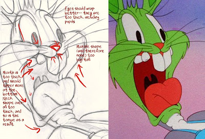
 Holy crap, I just look at it and I want to draw!
So, that's what I did. Couple breaks at work, and a work day one of my classes.

I was pleased with how much easier crazy, seemingly complex drawing is when you start to practice construction and hierarchy! It felt good. BUT...

I dulled down the pose! Which is sad because Bugs' face is just full of life and spunk. Tisk tisk. It should stretch, commit more. I made the base of his neck too thick. You can't really see it too well but I have the shape drawn underneath. It sort of got lost under a patina of pencil and eraser. Rest assured that it's there and it's too fat at the base, where it attaches to the body.
There's too much of a gap between the far left tooth and where his mouth starts!
I also think that I assumed his muzzle protruded more.

The angle of Bugs' body and the arch of his back are a little off. Also his tits don't sit right. My red-line is wrong on the bottom of his right boob. It doesn't show the crease on his bra right. Also they're further down on his body than they are in the cartoon.
 The top of the head is a little extreme. I didn't make the cranium shape large enough and I don't think his head-fat fits on as tightly. It also doesn't connect as well to the cheek fat in my drawing.
Next time in line: Eisenberg drawings, another coloring book image, continuing to get my ass kicked by animation.

Hey Gen!
ReplyDeleteAre you doing construction on the eyes? My reason for reminding you ( aside from it being a good rule to remember ) is because your Bugs looks like he is looking at Porky more convincingly than Scribner's.
The left eye looks like it is spot on Porky in yer drawing, but appears to be wandering in the original.
You probably don't need to do the construction in the eyes because yer much more advanced with yer drawing than I, but I'm finding that putting construction in EVERYTHING can be considered good form.
See ya!
- trevor.